AISTS
AISTS
AISTS
Art Direction, Motion design
Art Direction, Motion design
Art Direction, Motion design


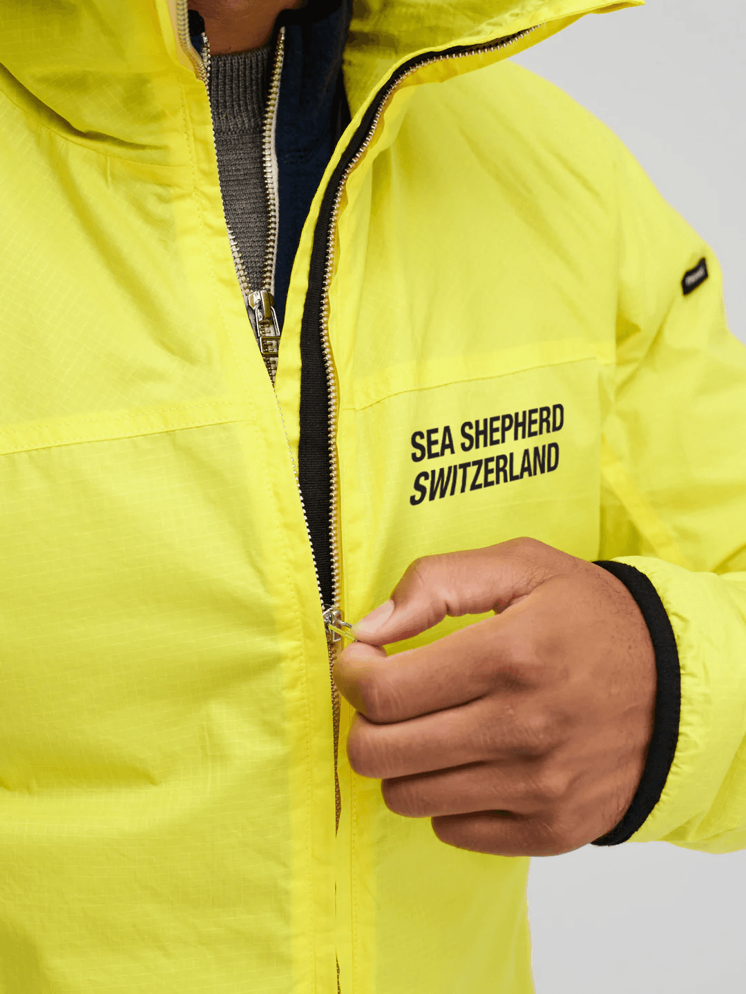
SEA SHEPHERD
SEA SHEPHERD
SEA SHEPHERD
Art Direction, Design Graphic
Art Direction, Design Graphic
Art Direction, Design Graphic

NIKE
NIKE
NIKE
Art Direction, Design Graphic, Mapping, Motion
Art Direction, Design Graphic, Mapping, Motion
Art Direction, Design Graphic, Mapping, Motion

LA PRAIRIE
LA PRAIRIE
LA PRAIRIE
Branding, Typography, Creative Consultancy
Branding, Typography, Creative Consultancy
Branding, Typography, Creative Consultancy

ZARA
ZARA
ZARA
Art Direction, Design Graphic, Motion, Film, Mapping
Art Direction, Design Graphic, Motion, Film, Mapping
Art Direction, Design Graphic, Motion, Film, Mapping


SOTAX
SOTAX
SOTAX
Branding, Art Direction, Film
Branding, Art Direction, Film
Branding, Art Direction, Film

CULTURE WAR
CULTURE WAR
CULTURE WAR
Creative Research, Visual Dialogue, Comtemporary Narrative
Creative Research, Visual Dialogue, Comtemporary Narrative
Creative Research, Visual Dialogue, Comtemporary Narrative
SCOTT
SCOTT
SCOTT
Art Direction, Film, Motion
Art Direction, Film, Motion
Art Direction, Film, Motion

LIFE OF CASH
LIFE OF CASH
LIFE OF CASH
Creative Analysis, Research, Edition
Creative Analysis, Research, Edition
Creative Analysis, Research, Edition


SWISSQUOTE
SWISSQUOTE
SWISSQUOTE
Branding, Typography, Platform & App Design, UI/UX, Art Direction
Branding, Typography, Platform & App Design, UI/UX, Art Direction
Branding, Typography, Platform & App Design, UI/UX, Art Direction


MAISON SILOM
MAISON SILOM
MAISON SILOM
Brand Strategy, Identity, Art Direction, Jewelry Design, Packaging
Brand Strategy, Identity, Art Direction, Jewelry Design, Packaging
Brand Strategy, Identity, Art Direction, Jewelry Design, Packaging


SICPA
SICPA
SICPA
Creative Research, Art Direction, Design Graphic, Infography
Creative Research, Art Direction, Design Graphic, Infography
Creative Research, Art Direction, Design Graphic, Infography

